Saturday, January 30, 2016

We Were Liars: a brief review

taken from Goodreads.com
All I really knew about this book was that one of my good friends read it a year ago and liked it a lot. At the risk of accidentally giving away really crucial plot twists, I'll be as brief as possible. The first half of this book was kind of eh. The second half of the book became much more of a little mystery and I got sucked in. THE END IS NUTS. The mostly good kind of nuts. And that's it. That's literally all I can say because otherwise I'll just end up rambling about the entire thing and give the ending away. And I really don't want to do that. So...I recommend it. You should read it, but just know it's a little different. Different, but definitely unforgettable (to take John Green's word from the review at the top of the book's cover).

Here's my updated 2016 reading goals list (remember I don't want to read only these books this year, just want to make sure I do read these):

Wednesday, January 20, 2016

Laundry room makeover update

Hey friends. Last week I shared our guest room makeover and the main bathroom makeover, and even though the laundry room is far from done, I wanted to share some pictures of what's been going on in there lately, as well as share our vision for what still needs to be done.

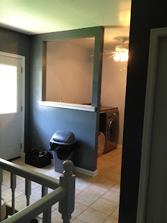
This is what our laundry room/mudroom looked like when we moved in:


We painted the walls and the stairway railings, and also added a countertop above the washer and dryer. Both made a huge impact on the room.


And then last year we added a small accordion drying rack which was really helpful.


The room was definitely way better than originally, but when we had a major leak in a wall and had to tear quite a bunch of sheet rock down, I used it as an opportunity to float some ideas by JT. We ultimately decided to take down that annoying half wall that separated the laundry room from the mudroom, and rotate the washer and dryer so that they sat next to the slop sink on that back wall.


Our best guess is that one of the times the pipes froze and then thawed last year, one of them burst. So we (JT) took down a ton of sheet rock, identified and fixed the leak, reinsulated the whole room because obviously it was lacking, and then we moved the washer and dryer. The room had a couple of different stalled points, the first being after the leak was fixed but the drywall was missing and the washer and dryer hadn't moved. 


The second was after we moved the washer and dryer and the wall was still there (talk about claustrophobic while trying to empty and load laundry). But now the wall is officially down! And it looks a thousand times better. 


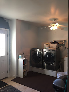
Having that wall gone is literally the best thing to ever happen to this room. It's amazing and it feels three times the size. You can see that we decided to forgo the countertop this time around, and built a box for the washer and dryer to sit on instead. There are a lot of pros and cons with having a countertop versus not having one, but the design we have in mind would make it pretty obsolete and we liked the idea of having the units raised to a more comfortable height. You also might notice that there is sheet rock patched, but it still needs a lot of work.

Here are some pictures of the rest of the awkward room.


That's some pretty snazzy baby proofing we did on the stairway railing, isn't it? Also, that blaze orange hoodie of JTs is BLAZE orange and it's all I see in that picture. 

Even though so much has been done, there's still somehow a ton that needs to be done in this room. It's mostly fun things, but a lot nonetheless. 

Here's the list:
  • move washer and dryer
  • build a box for the washer and dryer to sit on
  • reinsulate walls
  • patch drywall
  • finish drywall mudding 
  • buy rug for floor
  • install some kind of patch for the missing tile on the floor (under rug)
  • move accordion drying rack to a different wall
  • paint the back wall behind the washer and dryer
  • replace slop sink
  • install overhead cabinets
  • hang hook for dog towel
  • (have an electrician) relocate the dryer outlet
  • install faux shiplap on the remaining two walls
  • create/hang artwork
  • replace/possibly move overhead light
  • rewire the main light switch to include the lights over the stairway
  • repaint ceiling
  • install crown moulding
  • reorganize entryway table 
  • (long term, not right now) replace the tile floor
Yes. It's still a long list. This isn't a room that will be finished in a weekend, which is why I'm posting an update about it now rather than wait till the finished product. We're not really sure when we'll get to all these things but hopefully it's in the next several months. Some of it is pretty simple and straightforward, and some of it will be a real pain (painting the ceiling...ugh).

The biggest thing I'm excited about with this room is the shiplap walls! Fixer Upper, anyone? I love the look and I'm excited to incorporate it into our house. I have plans for it to show up in a couple other rooms in the house eventually too, which will be fun to have it all tie together and look intentional (because it is). Honestly, though, I think I might be even more excited to see this room look like a part of the house. A finished, warm, inviting and decorated part of the house. It's always just felt like a weird addition to me...the room we walk through to get in and out of the garage. The room we walk through to get to the basement (don't even get me started on those basement stairs...one day maybe I'll help them). The room we clean our clothes in and let the dogs inside in and feed them in. But not a real and true room. It's cold (literally and figuratively) and blah. But we're making some great steps towards it not feeling that way, and I'm excited.

Sunday, January 17, 2016

The Nesting Place: a brief review

taken from Goodreads.com
I just finished this book and I don't really know where to even start with my review...I just know that I want to tell the world all about it. I've been reading The Nesting Place blog for a couple years now and am in love, so I knew I would love this book. I thought of it as more of something to cross off the list, though, kind of like something to just say I did because I already knew I loved her. But goodness. I'm so glad I read the book, not necessarily because I learned something new or different than what she talks about in her blog, but because having it all in such a condensed, concentrated place was amazing and exciting and convicting and challenging and freeing.

Myquillyn Smith, also known as "The Nester," challenges people (mainly women, let's be honest) to be content and love the home they're already living in, no matter what. Regardless of financial handicaps, regardless of how weird or broken the house is, regardless of whether we own it or are renting it, regardless of whether it's the short term living arrangements or the forever home. Her catchphrase (which has already been incorporated into our everyday conversation in this house, which is kind of a big deal) is "It Doesn't Have to Be Perfect to Be Beautiful." And you know what? It really doesn't. I'm learning that and so is JT. There's a lot about our house that isn't perfect. There's a lot about our decorating that isn't perfect, and there's a lot about where our house is right now that isn't where we perfectly hope to have it one day. WHO CARES. It's still beautiful. It's still our house. It's still functioning, keeping us safe and dry, and it's, truthfully, so much more than we should ever have. I'm not aiming for overused cliches when I say that we are incredibly blessed with this house. I have gotten mad at it and grumpy about it and threatened to burn it down and begged my husband to move me out of it....but honestly, I love it. I love this house. I'm sitting here right now in the dining room looking at this house and thinking about all the inspiration reading this book gave me, and dreading the day we one day have to move. I'm rambling, but I don't even care. In fact, I'm nowhere near done rambling.

This book spoke to me in ways that I didn't see coming. It helped me see the beauty in what I already have. It helped me see that I shouldn't be dreaming about the next house we have when this house we're already in is a wonderful gift that we get to live in. It helped me see that the perfectly designed house that looks like it was created for Pinterest won't make me happy, but that a house that we've filled with functional, pretty, comfortable, useable things that work for our family will create a home that is safe, warm, inviting and relaxing. (That sentence had a LOT of commas. My apologies.) Basically, this book isn't about home design nearly as much as it's about contentment. 

If you live in a rental home/apartment and you're afraid to make any changes even though you hate a lot of cosmetic finishes, read this book.

If you live in a rental home/apartment and you're unhappy because you wish you owned a house, read this book.

If you live in a home you own that you get mad at/frustrated with/grumpy about because you wish you had more money to make it pretty, read this book.

If you live in a home you own that you regret buying, read this book.

If you are constantly trying to make your house look perfectly spotless and put away and look like a show house so you can impress your friends, read this book.

If you think your home is too small, too big, too ugly, too modern, too dated, too [fill in the blank], read this book.

If you're looking for practical ways to make changes and updates to make your house feel more like home, read this book.

If you feel like your home doesn't really reflect your style, read this book. 

If you live in a home that you like most of the time but sometimes have raging pity parties because you find yourself in the flooring aisle of Home Depot and you wish your floors had THAT tile instead of the tile it has (this is me, in case you couldn't tell), read this book.

Honestly, just read this book.

Guys, I don't even love everything about her style. That's so not the point. I can't say it enough: this really isn't a decorating book nearly as much as it's a book about how to be content and thankful for what God has given you right this instant. It helps give you ideas and it does give practical advice, but most of all it encourages. And that is a book worth reading (over and over, probably).

Thursday, January 14, 2016

To All the Boys I've Loved Before: a brief review

taken from Goodreads.com
This was one of the Green Valley Book Fair buys that made it onto my 2016 reading goals list. But I was always tentative about it because I didn't love the only other Jenny Han book I've read, The Summer I Turned Pretty. That book was very simple and very predictable and somewhat boring, really. This one started out that way and I thought I was doomed to 300+ pages of uninteresting teen romance, but THEN there were a couple little twists and I got sucked right in. To be honest...it might in reality still be dumb teen romance, but I really enjoyed it and wanted to keep reading. And when it ended on a cliffhanger, I REALLY wanted to buy the next one right away. I didn't...I did the right thing and got a library book instead. But the next book I read after the library book will most likely be the sequel to this.

Wednesday, January 13, 2016

Main bathroom makeover

I mentioned last night with my guest room post that we've made some updates so several rooms in the house over the last couple of months. Although Charlotte's playroom and the laundry room are still works in progress, the other room that's been finished is the main bathroom.

Up until this November, we really hadn't done anything to this bathroom since the day we moved in. We hung up a shower curtain we already owned, put down some bath mats and hung a (much too small for the wall) picture of a sunflower field on the wall above the towel rack. Until Charlotte graduated from the kitchen sink to the bathtub, we literally never used this bathroom so it was easy to forget about. It is, however, the main bathroom for guests and the only full bath in the house other than the master bathroom. So even though we never used it, it did get used from time to time. I'd kept it in the back of my mind to change at some point but it wasn't an emergency at all. Now that we spend a lot more time in there with Charlotte on bath nights, I wanted to give it some updates that will help propel the room into its main purpose for the next handful of years: the kids' bathroom.

I wanted it to be a young, bright, kid bathroom without being too over the top and matchy-matchy. Even though they make some really cute bathroom sets out there where the shower curtain and the soap dispenser and the toothbrush holder and the bath mats all match, I wanted to avoid it and go with more of a primary colors/animal theme instead. Here's the finished product:


I started by painting the walls a medium-grey, and then from there the first item of inspiration was obviously that shower curtain. Isn't the absolute best? I love that it's got bright primary colors and animals but is so subtle it's not obnoxious and in your face. This isn't really the world's biggest bathroom, either, so having too loud of a shower curtain would have been overwhelming I think. The bath mats are the same color as the blue leaves in the curtain, so that made it easy. From there I just picked small things we could change in the room and tried to focus on colors.


We switched out the mirror, hand towel hook, hand towel, soap dispenser, and knobs on the vanity but left the existing vanity and lights. When looking for the new items, I decided on white for the towels to balance the grey of the walls and the bright colors of everything else, but focused on bright primary colors in the accent pieces like the mirror, hook, and knobs.


Thinking ahead to when more than one little person is using this bathroom - Lord willing - we took out the towel bar and put in a row of hooks instead. We chose the awesome towels with hooks specifically and hung them a little lower to the ground to make it easier for toddlers of the future to hang their own towels up. (Please note the unicorn hooded towel on the end. My aunt and uncle gave it to Charlotte and it's monogrammed and now every child we ever has needs one. It. Is. The. Best.)

I also stuck a big white trash can next to the toilet to hold lots of extra toilet paper.


One more look from the doorway:


And one (kind of wonky because I used the panoramic feature to get the whole wall) view from the shower:


And that's it! In the future, we plan to add a white medicine cabinet above the toilet, and I will have to spend time organizing underneath the sink at some point. Right now there isn't really anything under there but some cleaning supplies and a trash can, but someday it's going to have to be a space that works pretty hard.


It was really fun to make these small changes and see such a huge impact. Just like in the guest room, we tried to save as much money as we could on this little makeover. Here's the basic breakdown:

Things we paid for:
  •  new towels (bath and hand towels): from IKEA, about $80 (they were about $10 each, and we got plenty of extras for both since IKEA isn't close)
  • small trash can for toilet paper storage: from IKEA, about $4
  • mirror: from Hobby Lobby, $50
  • small hook for hand towel: from Hobby Lobby, about $1.50
  • knobs for vanity: from Hobby Lobby, about $6
  • soap dispenser: from WalMart, about $8
  • bath mats: from Target, about $15
  • shower curtain: from Target, about $30
  • towel hook rack: from Target, about $20
  • paint: from Home Depot, about $30
This one did add up because of the towels and mirror especially, but we plan to keep the bathroom this way for quite a while and we're really excited with how it turned out.

I'll wait till the playroom is done - just two more things that need to be done - before I share it with you, but I think soon I'll share a progress update on the laundry room renovation and fill you in on what still needs to be done (hopefully over the next few months). 


Tuesday, January 12, 2016

Guest room makeover

Well friends, it's been a super long time since I've written about something other than books and/or yearly goals, but I'm really excited to share a couple room makeovers we've been working on the last couple months. The first room to be attacked/fixed was the guest room, and even though it's been done since before Charlotte's birthday, I swear the sun hasn't been out since and I haven't been able to take pictures until this week.

The guest room/office has been one of my least favorite rooms in the house since we moved in. I painted it almost right away which helped a lot, but I was constantly moving furniture around and reorganizing and then letting it become a huge mess again. I couldn't ever figure out how I wanted it to be, and I couldn't for the life of me keep it organized/picked up. It was a little embarrassing to have people stay in there with piles of unfiled paperwork and such scattered throughout.

We set up the room initially, and then I moved it all around one day for no reason, and then last year we got a treadmill and we rearranged the room for a second time to move that big boy in...and then I spent all winter, spring, and summer walking on that treadmill and staring at this room that was constantly a mess and that I did. not. like. trying to figure out how to move it all once and for all. I really wanted to figure out what made sense for this dumb room and then be done with it forever. Not a band-aide, not a temporary fix that would inevitably annoy me two months later, but a real fix that would be easily maintained and would look good. I wanted a welcoming place for guests that functions as an office (let's call it what it is: a place to store our family's excessive amount of documents), and that doesn't make me sad when I'm working out staring at it all.

First thing first: the documents. I had been using a small filing cabinet with one drawer and a handful of very general, nonspecific files. This just didn't work for both of those reasons: it was way too small and also wasn't nearly specific enough. When I'd have a bill or an insurance form or receipt that needed to be kept, I'd stare at the six files and wonder what the heck I should do with this piece of paper. So I bought two large plastic filing boxes from WalMart, took all of the pieces of paper our family currently owns and spread them all out on the floor, and spent exactly one evening reorganizing them all. I was as specific as possible (ex: instead of one file called "Medical," I have a file for each member of our family's medical information for each year, as well as separate files for special medical instances like JTs accident and my Birthing Inn stay). I made all new files and all new labels and it looks beautiful and clean and organized like whoa. A couple of times since then, a new document has come in and/or the need for a new file, and I've just made one and called it a day. It doesn't sit around for months until I see it and wonder what on earth that piece of paper is for. It's just filed and gone. It's amazing, and I love it.

Now for the good part. The cosmetic part of the guest room makeover.


I decided to leave the dark grey wall color, which turned out to be an awesome idea. I'm contemplating using the same/a very similar color in our master bedroom someday. Instead we switched out the bright green curtains (the color of that pillow on the bed) for white ones. I got rid of the bulky IKEA Lack table that was being used as a nightstand - waaay too big a footprint - for a collection of narrow end tables and barstools working as nightstands on either side of the bed. The addition of a $25 Goodwill headboard dramatically changed the bed, and whenever we get around to figuring out how to attach the matching footboard I'm sure it will have even more of an effect.


The large basket to the right of the bed stores a queen size extra blanket and the small white basket under one of the nightstand tables has extra phone chargers.


I wanted to change up and add to the art in this room, but I didn't want to spend a lot of money on anything in this room (more on that in a minute). So I bought the fruits and veggies poster from The Lady Jane in Harrisonburg, but made the rest.


I've always had two identical desks in this room, pushed together to either make one long desk or a big square table. Both layouts worked really well, but just took up so much space in this room. If I spent a lot of time working at the desk I might justify having the extra surface space, but since it rarely/never happens right now, it made a lot more sense to move one to the basement and save the real estate. I love the change it made. That plus the addition of my great-grandfather's old office chair makes this desk a fashion statement rather than just something taking up space. I love how this corner came together.


The treadmill is huge and imposing and really tries to dominate the room, which is why I had such a challenge initially. I didn't want the room - and our guests - to feel like they were sharing the room with my exercise equipment...I wanted the treadmill to be more of a hidden afterthought in the room. I think that came as close as possible to happening by putting it in this corner. It kind of blends in and doesn't dominate the room, and I have a great view when I'm working out. I have a charger for the iPad, my sneakers, some washcloths to...um...dry myself off with, and a yoga mat hidden on the other side of the treadmill too.


I didn't want the wall space around the treadmill to go completely wasted, though, so I made some art using two of my favorite motivational lines. Thanks, Tay Sway and also original Rocky movie. I owe all my treadmill motivation to you. (For those who are curious, those are just normal mats wrapped with beautiful fabric.


This chair was one of my family's dining room chairs for most of my life. My parents bought a dining room table when they were first married with four matching chairs, but there were six of us so for about fifteen-eighteen years we had four matching chairs, this chair, and a metal office chair. Looking back now, it's kind of bizarre but equally awesome. Somehow I inherited this chair (it wasn't even mine growing up, it was my sister's I think), and since I don't currently have a need for it at a table, I figured it should hold some of JT's old space textbooks and a plant.


The half bath in our guest room is still dated as ever, and honestly probably will be for many years. It's ugly and weird (who puts laminate tile on the walls, really?), but it's so handy and so cool to have a half bath in your guest room so I love it anyway. And who even notices laminate tile walls when you have an adorable picture of 10 month old Charlotte in a sunflower frame? (Thanks for the frame and the welcome sign, Grandma!)

And that's it! I don't really have before photos of this room which is ridiculous (and, I feel, a problem I've repeated multiple times), but you'll have to take my word for it that the change is dramatic. What was once an awkward, messy, confusing room has become a breath of fresh air that relaxing for both guests and me during my workouts. Now I look at this room and wonder how I can incorporate this light, airy, relaxing vibe into our master bedroom. One more look from the doorway:


I mentioned that I wanted to spend as little as possible on this. I wasn't looking for a major renovation, and it wasn't needed. Just a couple of intentional, though-out changes that had a huge impact. Here's the breakdown of everything in the room:

Things we bought:
  • new curtains: from IKEA, I believe they were about $10 a pair
  • curtain tie-backs: from WalMart, about $10 a pair
  • frames for all new artwork, all from IKEA
  • yellow barstool: from a thrift store, $15
  • headboard/footboard for bed: from Goodwill, $25
  • new rug for under office chair: from WalMart, about $20
  • the faux magnolia branch and flower: from WalMart, about $3 
  • fruits and veggies poster: from The Lady Jane, about $15
  • the small hook the poster hangs on: from Hobby Lobby, about $1.50
  • the "hello" pillow on the bed: $15
Things we got for free:
  • small table and other barstool used as nightstands: both from my aunt and uncle's garage (one has my aunt's high school's crest engraved on it!)
  • desk chair: my great-grandfather's office chair, from my aunt and uncle's garage
  • all other artwork: made by me
Things we used that we already had: 
  • the rug under the treadmill
  • the basket holding the extra blanket for guests
  • the extra blanket for guests
  • all bedding on the bed
  • the bed itself
  • the desk and small filing cabinet, printer, etc
  • the decorative chair, space textbooks, and plant
  • the green pillow on the bed 
I love that we spent very little on this room. I love that it's filled with family heirlooms and pieces of items collected from other places in the house. I genuinely love this room now, which is so refreshing to be able to say.

Tomorrow I'll share the main bathroom makeover we did back in November.

Friday, January 8, 2016

Forgive Me, Leonard Peacock: a brief review

taken from Goodreads.com
This was one of the Green Valley Book Fair books I mentioned in my 2016 goals post. I can't lie...it's kind of a bummer. I don't really know why I bought it. It's about a kid who is planning on killing his classmate and then killing himself on the day the book takes place...which also happens to be his birthday. It was written well and definitely sucked me in, but most of it was definitely really sad.

Here's my updated 2016 reading goals list now:

  • For the Love, by Jen Hatmaker
  • Good News for Weary Women, by Elyse Fitzpatrick
  • Bittersweet, by Shauna Niequist
  • Bread & Wine, by Shauna Niequist
  • Parenting with Scripture, by Kara Durbin
  • Love and Respect, by Emerson Eggerichs
  • The Excellent Wife, by Martha Peace
  • The Underdogs, by Markus Zusak
  • Every You, Every Me, by David Levithan
  • Every Day, by David Levithan
  • We Were Liars, by E. Lockhart
  • Reality Boy, by AS King
  • Forgive me Leonard Peacock, by Matthew Quick
  • Lindsey Lost, by Suzanne Marie Phillips 
  • Belle Porter series
  • To All the Boys I've Loved Before, by Jenny Han
  • Odds of Getting Even, by Sheila Turnage
  • Attachments, by Rainbow Rowell

Tuesday, January 5, 2016

The Watsons go to Birmingham: a brief review

taken from Goodreads.com
I've heard good reviews for this book from my siblings for many years, but I only just got around to actually reading it myself. I read Christopher Paul Curtis' book Bud, Not Buddy last year and loved it, so I was really excited about this one too. Curtis didn't disappoint. I loved this little family and their jokes and discipline and sibling fights and mischief. Loved it from cover to cover. I definitely recommend it!