I wasn't going for much style or perfection when it came to taking these photos, and I also didn't try to get into the details of each room. I still have big, crafty plans for each room and I'll post about those details and changes as I go.
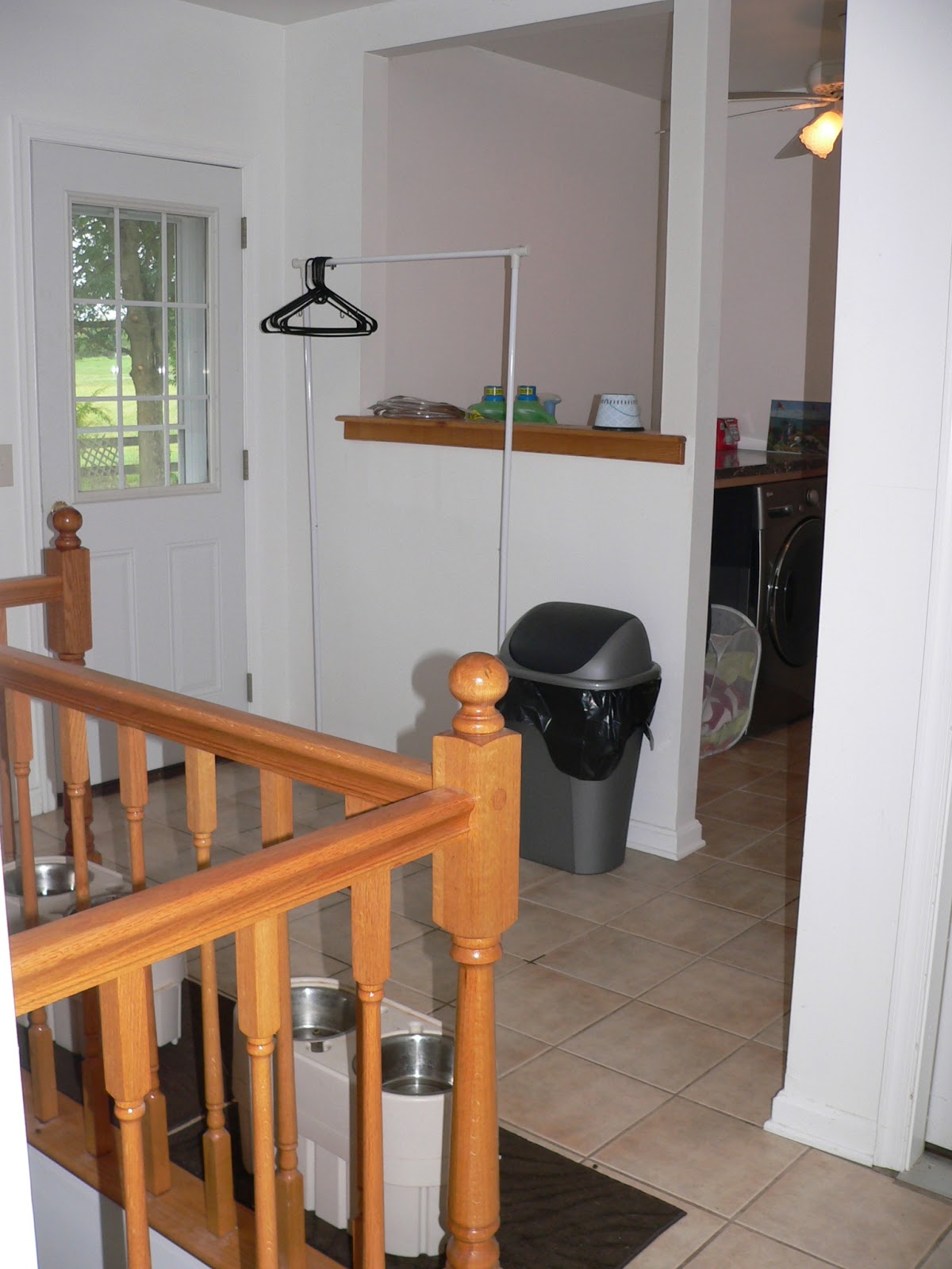
When we moved in, the entire house was a flat beige. Neither of us are beige people, but I didn't realize how much I hated flat paint until I had lived in this house for longer than three minutes. Why on earth would anyone paint anything with flat paint? I painted these two rooms, the den and the guest room/office, soon after we moved in. When we were beginning the process of painting the rest of the rooms about a month ago, I realized that the laundry room - which was actually white and not even beige - wasn't on the list. As a laundry room, it just wasn't high on the priority list. When I remembered I had extra paint left over from both of these rooms, though, I decided to use it to paint the laundry room for free. I wanted to paint the majority of the space with the dark gray and have two accent walls around the washer and dryer painted the mint green color of the den. As with most things, it didn't work out exactly how I'd imagined it, but I was able to squeeze three walls (tiny, awkward walls) out of the gray paint and only one accent wall out of the mint. Unfortunately, the laundry room was an addition at one point and the walls weren't really painted in the traditional sense, which meant the paint just didn't stretch as far as it should have. We did have to spend some money on getting this space painted, BUT it definitely wasn't as much as it would have been if we hadn't used the leftover paint we already had. We'll tweak it in the future, but for now it's much better than the dirty white that it was.
Laundry room before...
And laundry room after...
Clearly, the laundry room is paint central because of the slop sink. (A brief side note on slop sinks: get one. Always, always, always have a slop sink somewhere in your house. I can't even tell you how gross the inside of that sink is right now because of all the paint rollers and brushes I've cleaned in it over the last couple months. The fact that that's not what my kitchen sink looks like is extremely important...and yes, I will clean the slop sink once I'm done with all painting.) You get the point of the transformation, though. The mint accent wall is behind the washer and dryer, and since the huge pass through window is in the wall to the left of the units I was able to use the very last drops of paint to get that one too. It's not the dramatic accent wall I pictured, but I have plans that involve using some other leftover paint on it one day. Just not right now, because I'm tired of painting right now.
Next on the tour is the kitchen/dining room.
Kitchen/dining room before:
And kitchen/dining room after:
This one is really subtle, I know, but the new color in here is a brown that's several shades darker than the original beige. It's quite a bit more impressive in person, I will say. You can really tell the difference when you look at the contrast against the white trim in both sets of pictures. You can also see the original beige in the hallway when you look through that arched doorway, because we haven't done anything with the entry way and hallway yet. We're really happy with this color; we kept it somewhat neutral but it does make the trim pop a lot more and it's just a better color than the blah beige (I just hate beige).
Next, the family room.
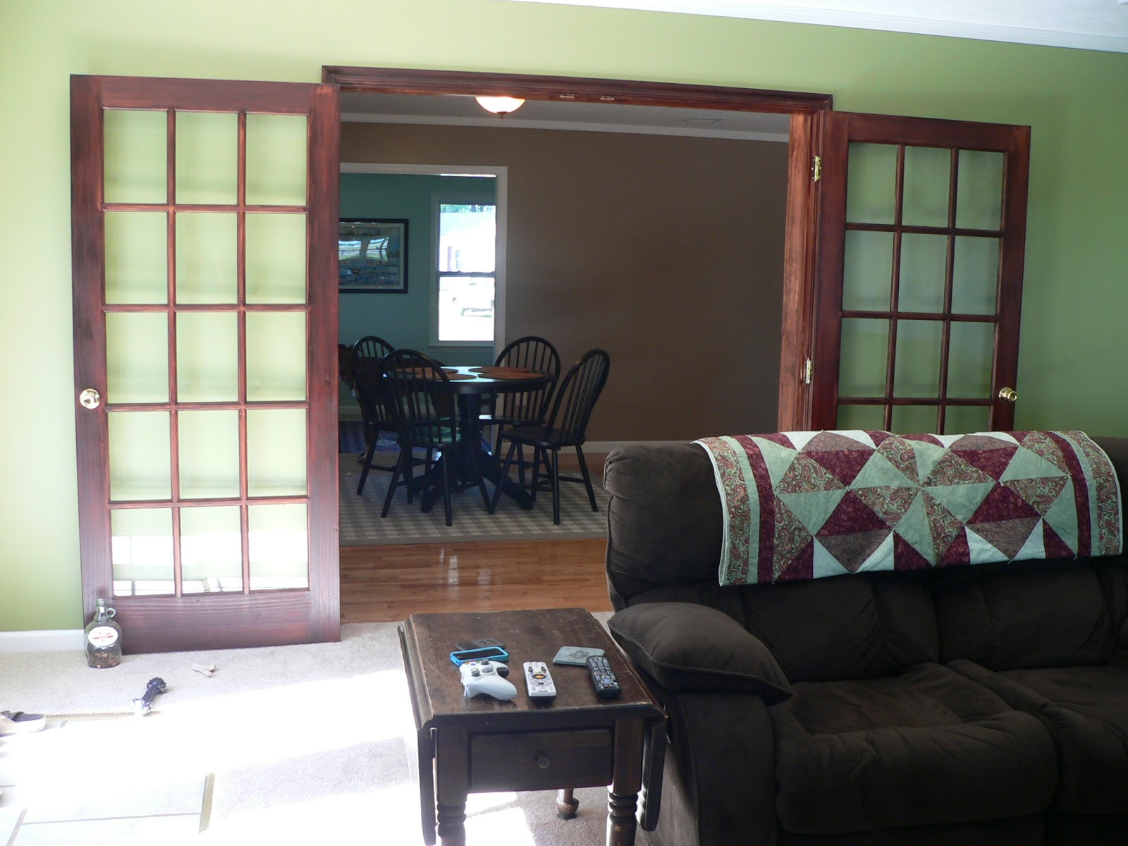
Family room before:
And family room after:
This green is probably the boldest color choice we made, but it's also probably my favorite of all of them. I love how it looks next to the stone of the fireplace, and I also love how it looks against those French doors and the couch. It's a really great room.
Last up on this new color tour, the master bedroom and bathroom.
Bedroom before:
And bedroom after:
I didn't take much in the way of pictures of this room, and I honestly can't remember why...but I will say that I have a lot of fun plans for continuing to redo our bedroom, so more pictures will come soon. But isn't it a fun color? It turned out a little bit brighter than I had envisioned, but it does look great against the white trim and photo frames, and makes the dark furniture pop. The bathroom got the same color treatment.
Bathroom before:
And bathroom after:
The blue looks really good against the cabinet - which for some reason came out super dark on here - and the dark floor tile, and all the white accents in here also look great against it. I'm a fan. I'm not, however, a fan of painting bathrooms. Definitely my least favorite room to paint, and I'm completely glad it's over.
So that's it. Color really does make a huge difference, and it is the most reasonably priced ways to make such an impact. It can take a lot of time and be a huge pain in the butt, but all things considered it's probably the most painless DIY/home renovation project you could tackle.
Now that that's behind us, I'm excited to see what else we can do in these rooms!


No comments:
Post a Comment