As far as the real point of this post goes, I revisited a previously adjusted project to tweak it for (maybe) the last time. This project originated for our anniversary in July, when I decided to frame the monogrammed letter pictures hubs had gotten when he lived in South Carolina. You know, those cool things where each picture is of an architectural detail that is shot in a way that makes it look like a letter of the alphabet? And then you get the letters in your last name, and they sit in a drawer for lots of years and then one day your wife surprises you with them in a frame for your first anniversary. Except in this case, I put them in a frame that I decided I didn't like once we hung it up. So I painted it white to match the other frames in our room. Unfortunately, this part of the evolution didn't take long, so I didn't bother with a real picture at the time. All I have to show for it is two pictures I took so I could Instagram mid-paint job.


Obviously, this was the first of a couple coats of paint. You can see the wood that the frame originally was, and even though I love wood the shade of it just didn't match the rest of the room. It bothered me, so I painted it to match. Here's what it looked like after the paint:
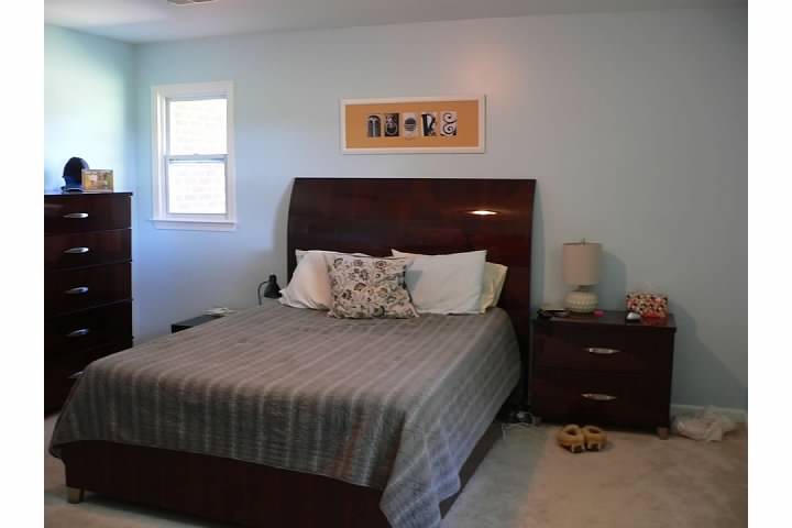

I was super happy with the white frame...but I still wasn't happy. That yellow was just too intense. It was a good idea when I picked it out; yellow was one of our wedding colors which had great sentimental value, and it did look good with both the original frame color and the black and white of the photos. But in the white frame...next to the new wall colors...eh. The blue turned out brighter than I had thought it would, and that yellow was just too intense on top of it. So I decided pretty much three minutes after I hung the newly painted frame that I would do something about that matting...and I decided about half a second after that that it would involve burlap.
I've already posted a couple projects so far that have involved burlap, so I think I should take this moment to explain why, especially since I have many more burlap projects planned. Burlap is kind of a fad right now - if you believe anything you see on Pinterest anyway - and even though I've gotten lots of great ideas from said fad, I like to think I loved it way before the wave hit. I've had my burlap TOMs for at least three years and I wanted them for several before that, so I have a lot of credibility here. Regardless, here are some reasons why I love burlap:
1. It's a neutral color that matches most other colors and therefore fits into most rooms easily
2. It provides a lot of texture to your design palette
3. It's cheap
4. It comes in various forms, so it's easily adaptable to any project depending on what thickness and how tight a weave you choose
5. It's a pretty timeless fabric, so even though it's a fad right now it's not something that's going to be obnoxiously out of style in a couple years
6. It's got a very rustic, rough and country spirit to it
7. Depending on what colors and objects you pair it with, it can very easily embrace different themes or design styles
8. I used a lot of burlap in our wedding decorating so it has a sentimental place in my heart
Because of that list, I see places for burlap everywhere in my home. I've had to dial myself back a little in some of those cases (not every room in my house needs burlap curtains), and I have made lots of notes and mental plans to tackle those projects in other cases. I just love burlap. But back to the evolving personalized picture...
That yellow really needed to be covered. By burlap.
This part of the project wasn't insanely hard to pull off, but it wasn't super easy either. The original matting didn't have those holes cut out; I had to spend a whole lot of time measuring and remeasuring to get the pictures where they needed to be and then I taped them down. So the idea of doing that all over again...with burlap...I wasn't excited.
First: I cut the burlap to size, an inch or so bigger than the original matting on all four sides.

Second: I traced a box where the pictures all are onto the burlap, slightly smaller than the picture to allow for wiggle room and overlap. I didn't want the Sharpie to show when I eventually glued the pictures down onto it. Because the burlap I'm using is such a rough and loose weave, it was really see-through and allowed for easy tracing, as you can see by the picture.

Third: I glued down the burlap to the matting. Because it was so see-through, I was stumped for a couple minutes here. I didn't really want to glue it onto the yellow matting and have it show through, thus defeating the purpose of this entire thing. But instead I glued it to the cardboard back board that came with the frame originally - which is the same color as the burlap so it wasn't obvious - and would use the yellow matting in the back as the back board instead when I put the whole frame back together.
I used that same all-purpose glue again here, which I am a huge fan of.

Fourth, Fifth, and Sixth: Here's where I messed up several times. I had traced the picture placement with the burlap just sitting on top of the original mat, but when I stretched the burlap out to glue it down tight onto the cardboard, the tracings all moved around and didn't stay in logical places. To be honest, I knew this was going to happen, I didn't know how to deal with it so I pretended it wouldn't happen, and it ultimately bit me in the butt. The burlap was secured tightly, but the Sharpie was all wonky and crooked and made for a challenge as far as covering it with the photos. I tried to eye ball it the first time, and they were all crooked and not in a straight line. So I started over, measured with an actual ruler this time, and tweaked their placements and the measurements until they were all in a straight line, all at equal spacing, and all covering up the original Sharpie lines. And I'm telling you, this was no fun. But it happened and it worked, and I love the finished product.


It's so much softer than the yellow, and it also matches the room a lot better. I have a couple burlap items already, but I have plans for a couple other key projects coming at some point. Even though I love a good accent color pop in a room, the yellow just wasn't doing it for me and I am much happier with the burlap. Because the answer to everything, class? That's right. Burlap.
One more before and after:
Yeah, the answer is always burlap.
No comments:
Post a Comment